BookBound
End to End Mobile iOS App Design
DesignLab UX Academy Case Study
Duration: 125 hours over 2 weeks
Project Brief
BookBound, a hypothetical company, wants to develop an app for book lovers. They aim to make the the process around reading, tracking, and discovering new books more exciting-- putting an emphasis on the user experience.
CEO & Founder Paulie Koelio wants to offer a personalized experience for BookBounds users. The company was created after Paulie realized how limited and antiquated other book catalogs were. He hopes that BookBound can offer a superior experience to its competitors (such as goodreads) and launch an application that will keep users coming back, engaged, and reading more.
Goals & Objectives
As the UX Designer I was tasked with:
Defining and developing cohesive branding that matches the company’s mission and values
Designing an end to end mobile iOS app
Allowing users to sign in/log in and create unique user profiles to track books they want to read or have read
Based on research, offer gamification features to increase user engagement on the app (leading to more reviews, ratings, use of lists, etc.)
Based on research, design any other features that would surprise and delight users
The Process
Research
Competitor Research
Surveys
1 on 1 Interviews
Define
User Persona
Product Feature Roadmap
Site Map
Task Flow
User Flow
Design
Sketches
Branding
Style Guide
Wireframes
Test
Mid Fidelity Prototype
Usability Testing
Affinity Map
Priority Revisions
Research
Main Goals
Identify users’ motivations to use a book catalog application
Identify users’ expectations when using a book catalog application
Identify what compels a user to start a new book
Understand the reasoning behind our users' decisions when selecting new books
Discover any user pain points when they are selecting a new book
Define user pain points when they are actively reading
Methodologies
Going into the research phase, I wanted to find out as much information as possible— I felt it was safe to assume that every individual has a very unique experience when it comes to reading (what genres they like, how often they read, when they read, etc.). In an effort to gain the most information within the limited time restrictions, I focused on three main methodologies to gather research that would help later shape my decisions. Each methodology proved to provide strong, general information, as well as individual experiences. I hoped that the data I gathered during my research phase would provide enough insight, and in turn, help me satisfy the (anticipated) diverse preferences of potential users.
Competitor Analysis
For a thorough understanding of the market and the offerings of other book catalog apps and sites
Survey
To gather quantitative insight about potential user reading habits and needs, likes and dislikes
1 on 1 Interviews
To obtain qualitative insight about users’ individual reading experiences
Competitor Analysis: Comparing features of direct and indirect competitors of BookBound
Competitor Analysis
Of direct/indirect competitors, most do not offer any direct link or direct purchasing option for books
Direct competitors’ branding is rather antiquated
Direct competitors offer discussion/friend features, less gamification
4/5 competitors offer a recommendation feature based either on the user’s habits or by providing alternatives to a book they’re viewing
Key Research Findings
User Goals
Read more books
To find and read books that provide value to the reader (entertainment, knowledge, relaxation, etc.)
Notable Findings
75% of interview participants feel the pandemic has noticeably affected how or what they read
75% of interview participants mention their mood affecting how and what they read
Most common source for book recommendation/discovery comes from someone they know and trust: friends/family/etc. (100% of interview participants, 68% of survey participants)
65% of all participants usually only read physical book copies, 21% of all participants usually read e-books exclusively
80% of all participants reported currently or previously tracking the books they’ve read/want to read
I was very surprised speaking with my interview participants — 75% of the participants mentioned how they felt some level of guilt when they were reading, that they should be spending their time doing something else (for work, for school, etc.). However, all of the participants looked to read to get away from technology or to relax. I assumed that due to the pandemic, my participants would have more time on their hands and be reading more, however this was not the case! If anything, this activity no longer became an escape but rather a chore. My participants wanted to shut their minds off completely, or tackle responsibilities that gave them trouble. I wanted to keep this information in mind as I entered the define phase. I started to ask myself, how can we reframe the way people think about reading and make it engaging? Help them feel like they’re using their time wisely?
Define
Using the information obtained from my preliminary research, I created BookBound’s typical user: Nina Granger. General identifying characteristics of Nina like age, location, gender, and occupation were determined by selecting the most frequent interview responses and survey results.
Nina’s goals, personality, emotions, brands, and her story evolved from the research findings.
User Persona: Nina Granger
Product Feature Roadmap
From my research, I left with a stronger understanding of BookBound’s users and their goals, expectations, and frustrations. Considering the goals of the business as well as the user, I created a road map to establish the details of the new BookBound app, highlighting additional features and prioritizing based on need, urgency, and time required to develop. My main objective was to create a complete and solid foundation, while simultaneously providing a delightful and exciting experience for users— newer features could be released as the company grows.
Challenges
BookBound’s CEO made it clear that they wanted to include a gamification aspect. However, from my research it was evident that users are looking to spend less time on their phones/using technology— that reading provides an escape from this. Considering the needs of the business and my user, I realized that I would have to find a balance. I needed to offer a gamification feature, without creating an addicting or distracting one.
I ultimately decided to create a feature that focused on exploration and discovery, by including a recommendation quiz. Additionally, I wanted to design a feature that would track personal accomplishments (like reading streaks). By offering less obtrusive gamification features, I would still be able to accomplish the goals of all parties— especially that of the business by engaging users consistently, and satisfying my stakeholder’s request.
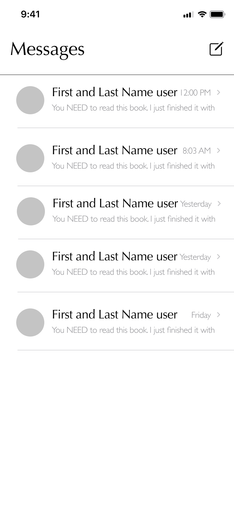
Finally, as discovered in my research, participants look to people they trust for book recommendations. It was critical that I highlighted this social element and allowed for discovery and exploration directly within users’ social circles. Adding a feature to highlight “Who you follow who have read this book”, and allowing users to follow others (and see their lists and message them directly), felt like appropriate solutions.
Task Flow
I created a linear task flow to show the progression of steps (of several of the main functions and tasks)—including the pages and actions that a user would find themselves facing.
This version of the task flow continued to evolve as the design process progressed. Simplifying the flow and reorganizing page/pop up modals helped streamline accomplishing the tasks at hand.
BookBound Task Flows
User Flow
Using the task flow as a starting point, I developed a user flow to show the potential decisions and actions a user may face while using the BookBound app. Similarly to the task flow, this user flow evolved as the design process continued. In an attempt to better organize and focus on the information hierarchy, as well as simplifying the process around tasks and integrating new features, appropriate changes to the user flow occurred. This user flow does not account for edge case scenarios but rather focuses on the primary actions (or variations of them).
BookBound User Flow
Product Requirements
Using the user flow and task flow as a reference point, I made a list of product requirements (necessary pages or pop ups) that would allow users to successfully complete main tasks on the BookBound app.
Tasks included:
Current user wants to see if a specific book is available from a local bookstore
User wants to follow an author on BookBound
User wants to add a book from their friend’s wishlist to their own
Design
Sketches
Using the information gathered during the research phase, I created simple sketches to begin structurally mapping out the BookBound app, making sure to consider the hierarchy of information and how it should be presented.
Branding - Logo
A huge portion of the requirements from the BookBound CEO included establishing and creating cohesive branding that the company could use — including but not limited to brand colors & developing a logo. The company was looking for something fresh in a sea of competitors. They wanted a logo and branding that would be recognizable, modern, and bright.
The logo was inspired by imagery associated with books and reading. Using the company’s name as a starting point, I focused on using familiar shapes and modernizing the logo to match. Iterations of the logo resulted in the finalized, rounded, book stack.
Style Tile
Throughout my competitor analysis, I noticed that both indirect and direct competitors tended to have a very antiquated look. Knowing the amount of content that would need to be displayed (both text and imagery of book covers, etc.), focusing on a simplified color palette and typography was a top priority.
Initially, the main brand color was a much brighter turquoise color— however, when paired with the bright purple CTA, the colors were competing. To fix this, I opted for a softer blue. I also toyed around with different shades and hues of my text and background colors. It was critical that I was able to create a specific feeling for BookBound users.
Looking to establish a more modern, sleek, and bright tone, I used cool white tones and focused on an analogous palette with blues and purples to achieve this. While it took several rounds of fine tuning to come up with the finalized color palette, my goal to create a harmonious color palette that diverged from the more dull palettes of competitors was achieved.
BookBound Style Tile
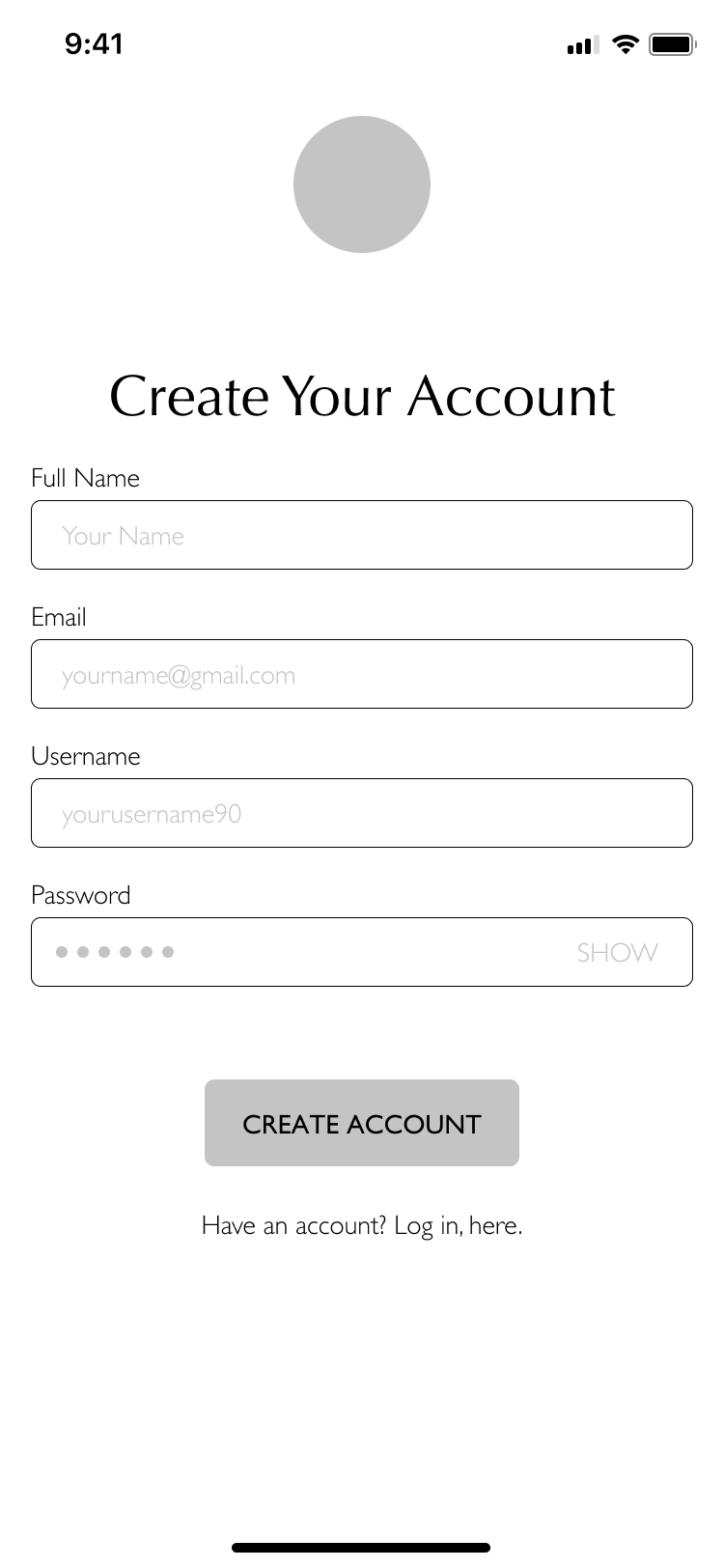
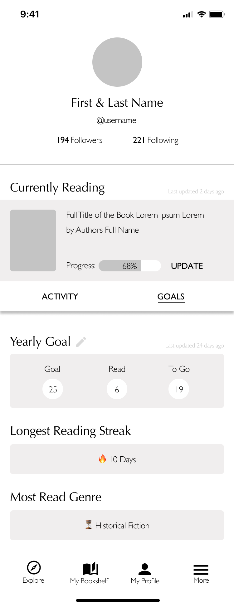
Lo-Fidelity Wireframes
Using my research, my product requirement list, and my sketches as a reference point, I developed my initial wireframes to start to bring BookBound to life.
Hi Fidelity Wireframes
With my lo-fidelity wireframes as a foundation, I applied the newly established BookBound branding to create my hi-fidelity renditions of my wireframes. Initially, during the design of my lo-fi frames, I felt that book covers would be sufficient for users to know what to click. Upon more thought, I realized that this would be an issue of accessibility. That information would simply not be enough— words on the book covers were not always clear.
Upon deciding that I needed to include text information about the books, I realized this created yet another challenge—varying title/author character lengths. How do you maintain accessibility and provide enough information to draw a user in, all while ensuring them easy navigation? I was determined to find the best solution. I chose to use a smaller font size, include the titles (omitting the author’s name) and cap the character count. While I had some concerns about the size of the text in regards to accessibility, I felt that at a baseline, this was a substantial amount of information to provide some frame of reference for the users— as a backup, users could always click into the items for more details. I decided that no matter my decision, my usability testing would later help to guarantee a positive experience that flowed.
Below are just some of the screens I designed that would later be used for my prototype.
Test
Prototype
I created a prototype to be used for testing in Figma. I designed additional modals and added details (such as drop down menus or interaction feedback) to create the most authentic experience for users navigating the prototype.
Click here, to see the mid-fidelity prototype used with my testing participants!
Usability Testing
Working with 3 participants, I virtually conducted my usability testing. I focused on having the participants try to complete 6 main assignments. These assignments included having users set up an account, take the recommendation quiz, learn more about a book, add a book to their wishlist, quickly rate a book they’ve read, and check their reading streak.
I documented how the participants navigated the pages, if they were successful in completing the tasks, as well as any emotions or requests they mentioned.
Affinity Map
I created an affinity map to organize the information gathered during my usability testing. My participants’ comments aided me in discovering what needed improvement, as well as what design modifications should be made immediately.
Key Takeaways:
All of my participants could articulate exactly what BookBound was offering — particularly noting the exploratory and discovery options as well as the social element.
2 out of 3 of my participants struggled at first to notice where on their profile personal stats would be listed. There was confusion around the jargon chosen, as well as issues identifying the tab to toggle between their news feed and goals.
Participants did not struggle to identify books listed on the explore page (providing added confidence in my decision to use smaller text in conjunction with the book covers)
The onboarding process and actual recommendation quiz were very intuitive for users
BookBound Affinity Map
Priority Revisions
Considering the information I gathered during my usability test, I made several immediate key changes to my designs. I prioritized the revisions that needed to occur based on time available and required to complete them, as well as how instrumental they would be in creating a product that provided the best overall experience. In addition to these immediate changes, I would want to continue to conduct usability testing and making the appropriate adjustments based on the participants’ feedback.
Immediate Changes
Under Profile - Added a popup that shows users what books they have read in their goal statistics
Included “Currently Reading” book on “My Bookshelf” page to encourage more updates and interactions
Created summary page at the end of the Recommendation Quiz (less abrupt ending)
Edited colors/line weights to make tab on profile stand out
Added location feedback to main navigation bar
Changed title used on profile tab (“Activity” to “News Feed”)
To see the wireframes with these updated iterations, click here!
Concluding Thoughts
I rooted my design decisions in my overarching goal: meeting the needs of both the client and the users. Working with BookBound provided its own unique challenges— particularly when it came to the presentation of information and how much it could impact branding.
The choices I made in order to design a product that was informative, accessible, and enjoyable were all guided by research and testing. If time allowed for it, I would have loved to have the opportunity to continue to do research, particularly on the gamification elements, as well as test and iterate on the hi-fidelity versions of the BookBound iOS app.


